通過再設計線上服務體驗,塑造食品電子商務新創企業的品牌形象
KoRo 是一家位於柏林的食品電子商務新創企業。針對千禧世代的飲食趨勢,專注於可長期保存的素食、有機食品,例如乾果、堅果和堅果醬。KoRo 向消費者強調五大產品概念:品質、短碳排路徑、大包裝、公平價格以及透明溝通。隨著市場的增長,KoRo 希望通過再設計其線上商店來擴展業務。
在 Yen 擔任 KoRo 平面設計師期間,她建議在再設計之前進行研究,計畫涵蓋了用戶研究、體驗設計、UI 和品牌設計。該項目在 Yen 任期內部分完成,最終成果包括用戶旅程地圖和 UI 原型。
Shaping the identity of a food e-commerce startup through the redesign of its online service experience
KoRo is a food e-commerce startup based in Berlin. Targeting millennial food trends, it specializes in long-lasting and vegetarian foods such as dried fruits, nuts, and nut butter. The company emphasizes five key product concepts to its audience: quality, shortened trading routes, large packages, fair pricing, and transparency with open communication. As the market grew, KoRo sought to expand its business by revamping its online shop.
Yen, working as a graphic designer at KoRo, suggested conducting user research before the redesign. The plan covered from research to design, including user research, experience design, UI, and brand design. The project was partially completed during Yen’s tenure, resulting in user journey maps and a UI prototype.
發現問題:從網站再設計到用戶研究的關鍵轉變
舊網站包含了除購物以外的多項功能,旨在滿足多種用戶需求,然而這些功能大多結構不佳,容易被目標用戶忽視。此外,網站並未能有效傳達其品牌形象。以下是促使我們決定進行用戶研究的幾個問題:
- 網站頁面過長,造成瀏覽困難。
- 許多區塊由於超長的滾動頁面而被用戶忽視。
- 許多區塊需要複雜的團隊協作,頁面設計的缺失導致了大量團隊努力、時間和資源的浪費。
- 重要資訊和功能(例如運費和優惠券輸入欄)未能被有效傳達或隱藏,降低用戶對品牌的信任度。
- 首頁包含五個全螢幕橫幅和十多個區塊,滾動過程中很容易迷失方向。
- 設計元素缺乏原創性,且未與品牌理念相連結。
- 不同頁面上出現了重複且冗餘的資訊。
Discovering Issues: The Key Transition from Web Redesign to User Research
The old website aimed to meet various needs and included multiple functions beyond shopping. However, many of these sections were poorly structured and, as a result, were often overlooked by the target users. Additionally, the website failed to effectively communicate its brand identity. Here are several issues that led to the decision to conduct user research:
- Excessively long pages throughout the site.
- Many sections were overlooked by users due to the endless scrolling.
- Many sections required complex teamwork. The inadequate design resulted in significant waste of team effort, time, and resources.
- Key information and features, such as delivery fees and the voucher input bar, were poorly communicated or hidden, undermining the brand’s credibility.
- The homepage featured five full-screen banners and over ten sections, making it easy for users to lose their sense of orientation while scrolling.
- Design elements lacked originality and failed to align with the brand’s core concepts.
- Redundant and repetitive information appeared across different pages.
企業挑戰:模糊的品牌形象
網站研究揭示 KoRo 的一個根本問題:企業形象不清晰,無法通過視覺設計有效傳達品牌。作為一家新創企業,KoRo 面臨著許多其他新創企業會遇到的問題:
- 企業願景與原則不明確(設計基於什麼?)
- 缺乏適當的行銷策略(要傳達什麼、如何傳達、對誰傳達?)
- 預算有限(該投入多少資源在網站上?)
- 專案規劃不足(網站功能依據主管的喜好和美學觀點不斷變動)
- 內部溝通不良(誰負責什麼?該如何協作?)
- 人力資源變動(如何維持網站運營?)
這些挑戰增加了網站再設計與維護的困難度,因此在進入網站設計之前,有必要回溯根本問題,並透過用戶研究探究企業的核心。
Challenges Faced by the Enterprise: Unclear Brand Identity
The study of the website revealed a fundamental issue for KoRo: an unclear corporate identity and the inability to effectively communicate its brand through visual design. As a startup, KoRo faces many of the common challenges that startups often encounter:
- Unclear vision and corporate principles (What is the design based on?)
- Lack of a proper marketing strategy (What to communicate, how, and to whom?)
- Limited budget (How much should be invested in the website?)
- Inadequate project planning (Web features kept changing based on the supervisor’s interests and aesthetic views)
- Poor internal communication (Who is responsible for what, and how should tasks be coordinated?)
- Changing human resources (How to sustain the website?)
These challenges make redesigning and maintaining the website more difficult. Therefore, it is essential to trace back to the root causes and investigate the core of the corporate identity through user research before diving into web design.
研究挑戰:說服相關人士、明確目標、尋找資源
研究計畫中的一大挑戰是持續說服主管,讓他們相信這項研究能在長遠發展上為企業帶來益處,儘管初期無法立即產生明顯的盈利。Yen 發現網站設計中的明顯缺陷被忽視的兩個主要原因為:
- 難以放手:主管同時也是這家初創企業的主要營運者,網站是他親手架設的,珍愛的作品難以放手,導致設計師無法介入協助。
- 害怕與真實用戶接觸:企業的服務內容完全倚賴線上數據,員工從未與現實世界的客戶互動,導致他們難以真正理解用戶需求。
這是一個艱難的過程,但 Yen 成功說服了主管。下一步是釐清目標究竟是重新設計網站,還是明確企業形象。若選擇後者,則需進行內部研究,以了解員工是否與企業核心理念保持一致。透過結合外部用戶研究,研究結果將能夠提供有關團隊結構與職責調整的建議,以確保員工能夠共享並執行企業願景,進而成為品牌的推動者。
可預見地,由於企業難以從第二個選項中獲得即時利益,最終選擇了第一個方案——重新設計網站。因此,Yen 將研究重點放在外部用戶上,接下來的挑戰則是如何在有限的時間與預算內找到足夠的資源。
Challenges of the Research: Convincing Stakeholders, Clarifying Goals, and Finding Resources
One of the key challenges in research planning was the ongoing need to convince the supervisors that the research would benefit the business in the long run, despite the lack of immediate profit. Yen identified two reasons why the obvious flaws in the web design had been overlooked:
- Reluctance to Let Go: The supervisor, who is also the startup’s primary operator, personally built the website. Like a cherished creation, it was difficult for him to relinquish control, leaving designers with little room to contribute.
- Fear of Engaging with Real Users: The business relied solely on online data for its services. Since the staff had never interacted with users in the real world, they struggled to truly understand their needs.
It was a challenging process, but Yen succeeded. The next step was to clarify whether the goal was to redesign the website or to establish a corporate identity. The latter would require internal research on employees to determine if they were aligned with the company’s core concepts. Combining these findings with external user research would help identify necessary reforms in team structure and role assignments. This would ensure that employees shared and executed the same vision as the company, ultimately turning them into brand advocates.
Predictably, the first suggestion—redesigning the website—was chosen, as the second option offered no immediate profit. As a result, Yen focused the research solely on external users. The next challenge was securing resources, given the constraints of limited time and budget.
專案規劃
在研究開始之前,Yen 從 Rlevance 的創辦人 Christian Vatter 那裡獲得了寶貴的見解。在他的指導下,研究計劃得到了結構化與精煉。核心團隊包括 Yen(專案負責人兼設計師)、Mark(品質主管,協助 Yen 進行專案規劃)以及 Roxane(實習生,負責訪談)。
他們將用戶分為四個類別:
- 潛在顧客——從未使用過網站的使用者
- 回訪顧客——曾多次使用平台的顧客
- 不滿意的顧客——曾向客服投訴的使用者
- B2B 客戶——企業客戶
Project Planning
Before the research began, Yen gained valuable insights from Christian Vatter, the founder of Rlevance. With his guidance, the research plan was structured and refined. The core team consisted of Yen (project lead and designer), Mark (quality manager, assisting Yen with project planning), and Roxane (intern, responsible for conducting interviews).
They categorized users into four groups:
- Potential customers – those who had never used the website
- Returning customers – repeat users of the platform
- Unhappy customers – those who had filed complaints through customer service
- B2B customers – business clients

質性研究方法
每個目標群體由 6 位用戶組成,他們被邀請到辦公室或通過電話進行訪談和用戶測試。他們的數據被記錄並整理成用戶旅程地圖,該地圖包括服務接觸點、用戶行為、情感反應和痛點。
針對不同群體的需求設計問題格式,除了 B2B 客戶之外,其他用戶被邀請到辦公室進行訪談和用戶測試,並提供像是亞馬遜禮品卡(針對潛在顧客)或 KoRo 禮品卡(針對回訪顧客)的補償。問卷形式分為四個部分:
- 一般背景資訊
- 線上行為與偏好
- 在 KoRo 的經驗(不包括潛在顧客)
- 任務 / 用戶測試
- 意見回饋
訪談中為用戶分配了任務,要求他們查找網站上特定產品或功能的訊息,涵蓋了整個線上購物體驗,從搜尋到支付,並延伸到網站的其他功能(例如價格圖表、食物日誌、評分區)。這些測試幫助識別當前線上服務的痛點,並評估額外功能對用戶的實用性。
Qualitative Methodology
Each target group consisted of 6 users who were invited to the office or contacted via phone for interviews and user tests. Their data were recorded and organized into user journey maps, which outlined the service touchpoints, user actions, emotions, and pain points.
The question formats were designed to address the specific needs of different groups. With the exception of the B2B clients, users were invited to the office for interviews and user tests, with compensation such as Amazon vouchers (for potential customers) or KoRo vouchers (for returning customers). The question forms were divided into four parts:
- General Background Information
- Online Behavior and Preferences
- Experience with KoRo (except for potential customers)
- Tasks / User Test
- Feedback
During the meetings, tasks were assigned to users, asking them to find specific information about products or functions on the website. The tasks covered the entire online shopping experience, from searching to payment, and extended to additional website features (e.g., price graph, food journals, grading section). The tests helped identify the pain points of the current online service and assess whether the additional functions were useful to the users.
數據證實了進行研究前已經識別出的痛點
收集到的數據證實了進行研究之前已指出的痛點。這些痛點包括:
- 頁面過長。
- 聯絡資訊不夠透明。聯絡頁面僅提供了聯絡表單,許多用戶不得不在「Impressum」頁面中尋找電話號碼和電子郵件地址。
- 運送資訊難以找到。
- 優惠券輸入欄不易識別,並且在結帳流程中出現了兩次,使用戶感到困惑。
- 產品分類造成混淆。
- 產品詳細資訊(如成分或保存方式)難以找到。
- 介面未能有效傳達可用服務,用戶經常詢問已經提供的資訊。
- 技術缺失:加載時間過長、拼寫錯誤、無效鏈接、缺少照片、產品資訊不一致、錯誤的產品認證標章(如有機、素食等)、熱門產品經常缺貨。
The data affirmed the pain points that were identified prior to conducting the research.
The collected data affirmed the pain points which were identified before conducting the research. These include:
- Pages were too long.
- Contact information was not transparent. The contact page only provided a contact form, and many users had to look for the phone number and email address in the “Impressum.”
- Shipping information was difficult to find.
- The input bar for vouchers was not easily recognizable and confusingly appeared twice during the checkout process.
- Product categories caused confusion.
- Product details, such as ingredients or storage information, were hard to find.
- The interface failed to effectively communicate available services, leading users to request information that had already been provided.
- Technical flaws: long loading times, misspellings, broken links, missing photos, inconsistent product information, incorrect product certifications (e.g., organic, vegan), and popular products frequently being out of stock.
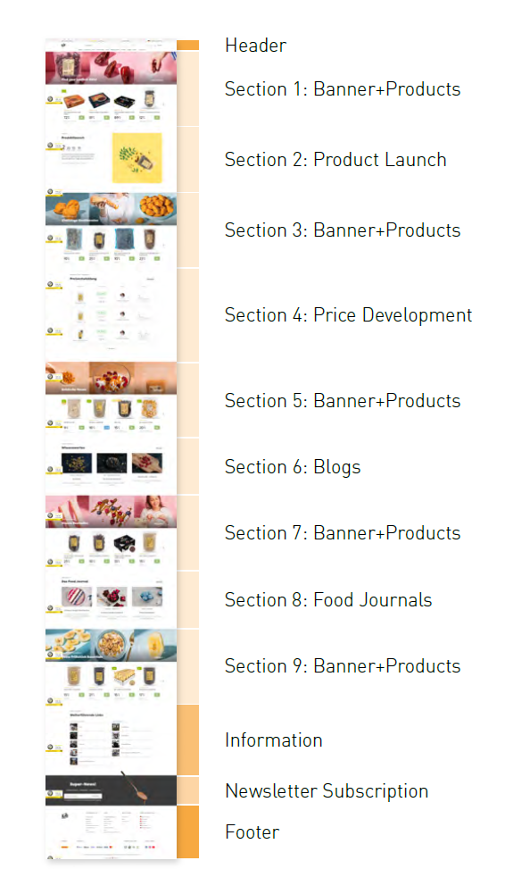
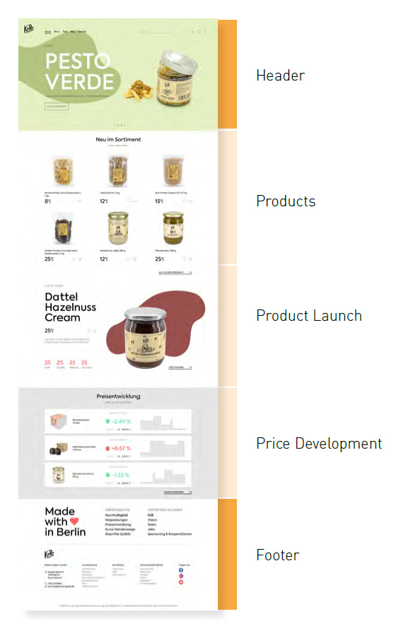
原型設計:重新定義首頁
首頁的再設計旨在解決以下問題:
- 頁面過長且全幅橫幅導致導航困難。
- 大多數用戶未能滾動到頁面底部,導致像是食物日誌和 podcast 這些吸引用戶的內容被忽略。
- 頁尾顯示重複的資訊。
該原型提供了以下解決方案:
- 精簡區塊:使用導航欄和下拉選單來縮短頁面長度,清晰呈現可用產品及內容,如食物日誌和 podcast。
- 重新定義標題區塊:使用幻燈片展示多個新產品,全屏橫幅設計可容納各種類型的廣告和照片樣式。
- 優化產品發佈區塊: 重新設計產品發佈區塊以簡化工作流程。原有的產品照片需要與攝影師、設計師和行銷團隊密切合作,流程複雜,新介面確保一旦白底照片準備就緒,產品便可快速上線。
- 重組頁尾: 提供清晰的附加訊息和企業價值概覽。
Prototyping: Redefining the Home Page
The redesign of the home page aims to address the following issues:
- The overly long page and full-length banners caused navigation difficulties.
- Most users did not scroll down to the bottom of the page, leading to appealing content like food journals and podcasts being overlooked.
- Repetitive information was displayed in the footer.
The prototype provides the solutions as following:
- Refined sections: Use headers and drop-down menus to reduce page length and provide a clear overview of available products and content like food journals and podcasts.
- Redefined header: Use slides to promote multiple new products. The fullscreen banner design allows for flexibility in presenting various types of ads and photo styles.
- Optimized product launch section: Redesign the product launch section to streamline the process. The original process, which required extensive collaboration between photographers, designers, and marketing teams, was complicated. The new interface ensures products can be launched quickly once the first white-background photos are ready.
- Reorganized footer: Provide a clear overview of additional information and corporate values.
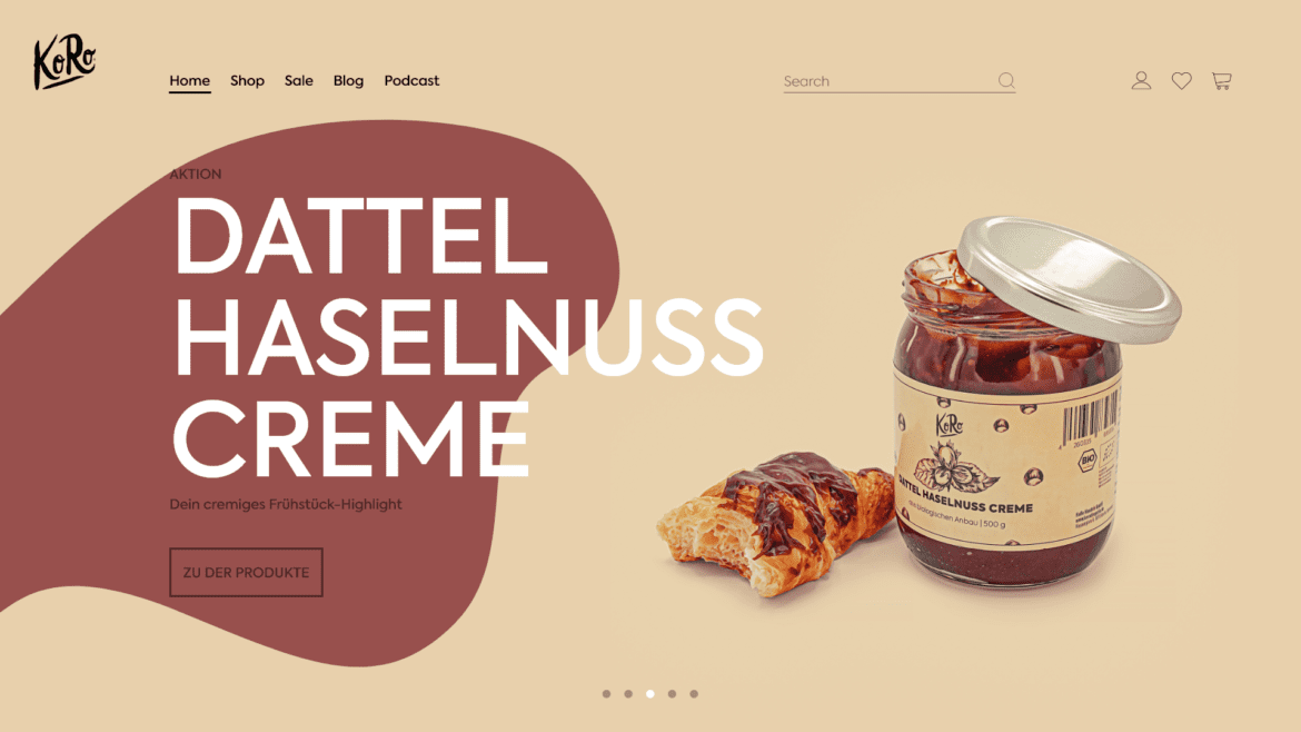
首頁提供空間展示不同類型的橫幅和照片風格。
The entry page allows space for various types of banners and photo styles.


下拉選單提供清晰的產品及內容概覽,如食物日誌和 podcast。
Drop-down menus offer a clear overview of products and content, such as food journals and podcasts.


產品發佈區域滿足緊湊的發佈時間表,只要攝影師提供白底照片即可上線。
The product launch section meets the need for a tight launch schedule, as long as the photographer delivers white-background photos initially.

新的定價開發區域去除了員工照片和價格變動原因,因為這些往往提供不充足的資訊。
The new pricing development removes staff photos and reasons for changes, which often provided insufficient information.

頁尾提供清晰的服務導航,並傳達 KoRo 所秉持的價值觀。用戶最常要求的聯絡資訊現在變得容易取得。
The page footer provides clear navigation of services and communicates the values KoRo upholds. The contact information, most requested by users, is now easily accessible.

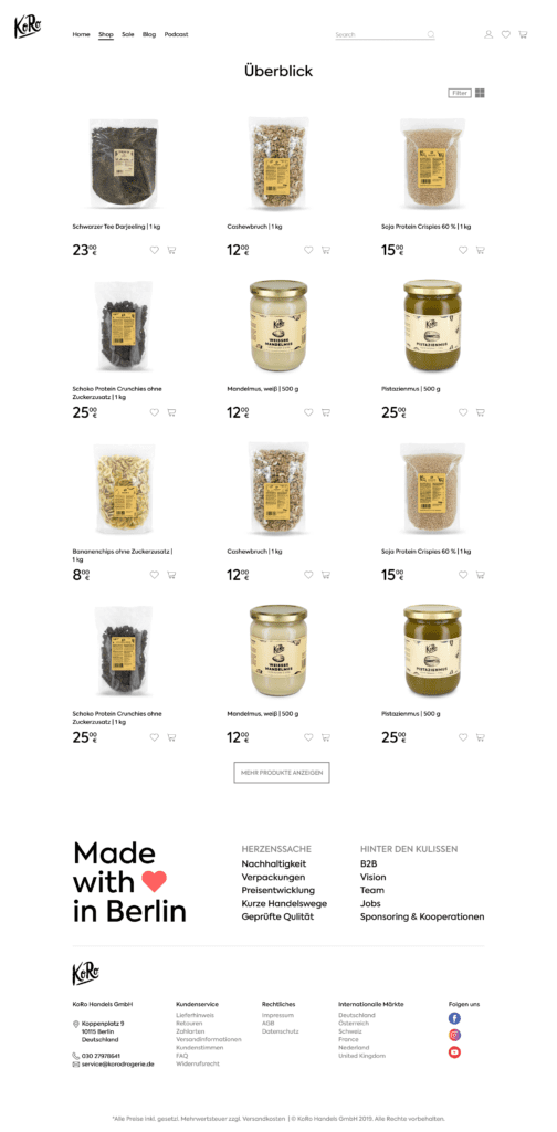
將產品概覽專注於購物功能
產品概覽頁的設計專注於購物功能和篩選器。部分用戶較喜歡使用篩選器來尋找特定產品,而非搜尋欄,清晰的篩選導航能夠提升搜尋體驗。
Focus the product overview on its shopping functionality
The redesign of the product overview page focuses on shopping functionality and filter design. Instead of using the search bar, some users prefer to use filters to find specific products. Clear filter navigation enhances the search experience.
重新安排產品細節的優先順序
使用者測試顯示,大多數使用者不會捲動產品頁面到產品細節區塊以下。額外的資訊,如價格圖表、評分區、口味測試和食物日誌,可能會引起他們的興趣,但經常被忽視,然而這些區塊通常是員工最耗時的任務。這些區塊是否必要?如何展示它們才能符合不同使用者的需求?
原型提供了以下解決方案:
- 精簡區塊。
- 將用戶最為需求的訊息,如成分、保存資訊、運送細節和產品使用說明(FAQ),移至頁面前方。
Rearrange the priority of product details
User tests revealed that most users do not scroll down beyond the product detail sections on product pages. Additional information, such as price graphs, grading sections, testing, and food journals, could be of interest but is often overlooked. However, these sections are typically the most time-consuming tasks for employees. This raises the question of whether these sections are necessary and how to present them in a way that aligns with the interests of different parties.
The prototype provides the following solutions:
- Refine sections.
- Move the most requested information—such as ingredients, storage, shipping details, and product instructions (FAQs)—to the front.
調整產品細節的優先順序,讓使用者能夠在第一眼注意到,像是成分、運送資訊和常見問題(FAQ)等資訊現在更易於取得。
Adjust the priority of product details for users’ first glance. Demanded information, such as ingredients, shipping, and FAQs, is now easily accessible.


全面的研究有助於揭示企業所持有的核心價值
在日常設計工作、管理職責、研究以及有限資源的平衡中,Yen 不會將這視為一個全然成功的專案。然而,藉由網站的再設計,她意識到建立企業形象的重要性,並發展以人為本和經驗設計的思考模式。在她看來,企業形象就像品牌的根基。不僅僅是用來推動銷售的商業工具,更是品牌與顧客和員工達成的協議。根基穩固的品牌會在各個層面開花結果,而深入的研究能幫助揭示企業所持有的核心價值。
A thorough research helps uncover the essential values a corporation holds.
Balancing daily design tasks, management responsibilities, research, and limited resources, Yen would not consider it a fully successful project. However, the positive outcome was that she recognized the importance of establishing a corporate identity and developed her thoughts on human-centered and experience design. In her view, corporate identity is like the root of a brand. It is not just a commercial tool to drive sales, but a pact with its customers and employees. A brand, rooted in a firm corporate identity, will flourish in various ways. Thorough research helps uncover the core values that a corporation holds.